How to add dark mode to your NextJS site with Tailwind
Adding dark mode to your site in just 15 minutes using next-themes.
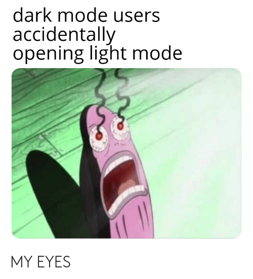
Before we start, we ask the question: why dark mode?
The myth that dark mode is better for the eyes has been dispelled by numerous studies.
That said, dark mode is still all the rage these days, with many surveys reporting that users predominantly prefer to use dark themes.
And we all know that developers love dark mode.
Great, so how do I implement dark mode?
There's many ways to go about implementing a dark mode, in this article, we'll be using next-themes, a package that makes setting up dark mode a breeze.
A dark theme requires a few ingredients:
- The state: what is the current theme?
- A way to toggle the state: usually in a form of a button, but we'll also take a look at how to get the user's system theme.
- Styling the dark mode itself: we'll achieve this with the help of TailwindCSS.
Next-themes
The easiest way to implement dark mode is through the use of a package called next-themes.
We can install it by running npm install next-themes.
Once it's installed, we need to import the ThemeProvider and wrap our app with
it.
import { ThemeProvider } from 'next-themes'

function MyApp({ Component, pageProps }) {
  return (
    <ThemeProvider attribute="class" defaultTheme="system">
      <Component {...pageProps} />
    </ThemeProvider>
  )
}

export default MyApp
We also want to pass in attribute="class" and defaultTheme="system".
attribute="class"enables us to use Tailwind to style using class-based components.defaultTheme="system"allows us to respect the user's system theme. If not, the default theme will be light.
With this setup done, we can move onto toggling and reading the current theme.
Toggling and storing the theme
In this example, we'll create a toggle in the navbar with some material design icons.
import { MdDarkMode, MdLightMode } from 'react-icons/md'
import { useTheme } from 'next-themes'

const Navbar = () => {
  const { setTheme, resolvedTheme } = useTheme()

  return (
    <div className="navbar">
      <div className="sidebar-icon">
        {resolvedTheme == 'dark' ? (
          <MdLightMode onClick={() => setTheme('light')} size="22" />
        ) : (
          <MdDarkMode onClick={() => setTheme('dark')} size="22" />
        )}
      </div>
    </div>
  )
}
We use resolvedTheme here to account for the system theme.
We use a simple ternary to check for the resolvedTheme and render the switch accordingly.
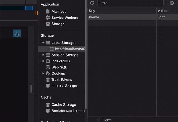
Now, to check whether this is working, we can head into the chrome dev tools and pull up the application tab.
Under application > storage > local storage > localhost:3000, we should see a
theme key with the value: light or dark, depending on the current theme.
Try toggling the button to see if it works.
Great! Now what's left is the fun part - the styling!
Styling your dark mode
Since we're using Tailwind, we can use the very handy dark: utility to style
the dark mode.
Just like the breakpoint utilities, we use the dark utility to apply classes
conditionally based on the theme.
<body
  className="bg-white transition-colors dark:bg-black dark:text-neutral-300"
>
  {...}
</body>
For example, this means that body will normally have a background-color of
white, and when dark mode is active, bg-black and text-neutral-300 will be
applied.
The transition-colors will give a nice transition animation when the theme
changes, but you can play around with Tailwind to find what you like.
And with that, dark mode is all setup! Play around with the colors to find out what you like.
It's a good idea to refer to some design guidelines to ensure accessibility.
Side notes
-
It's best to apply a filter to images in dark mode. I found this from CSSTricks
globals.cssimg { @apply dark:brightness-[0.8] dark:contrast-[1.2]; } body { @apply dark:font-light; } -
Dark theme does not mean white text on a black background
Typography is pretty nuanced and complicated, dark mode makes it harder still. I think this is a great article that highlights some things to consider about typography in dark mode.
That's it! Thanks for reading!